
50 B2B SaaS Homepage Teardown
50 B2B SaaS Homepage Teardown
Your homepage is not a brand statement. It is a conversion surface.
For B2B SaaS companies, the homepage must explain value fast, build trust instantly, and guide visitors toward the next step without friction. Small changes in structure, messaging, or hierarchy can significantly impact activation, pipeline quality, and revenue.
This analysis breaks down 50 B2B SaaS homepages side by side to uncover the patterns, decisions, and trade-offs that top SaaS companies make. The goal is not to copy layouts but to understand how high-performing homepages communicate value.
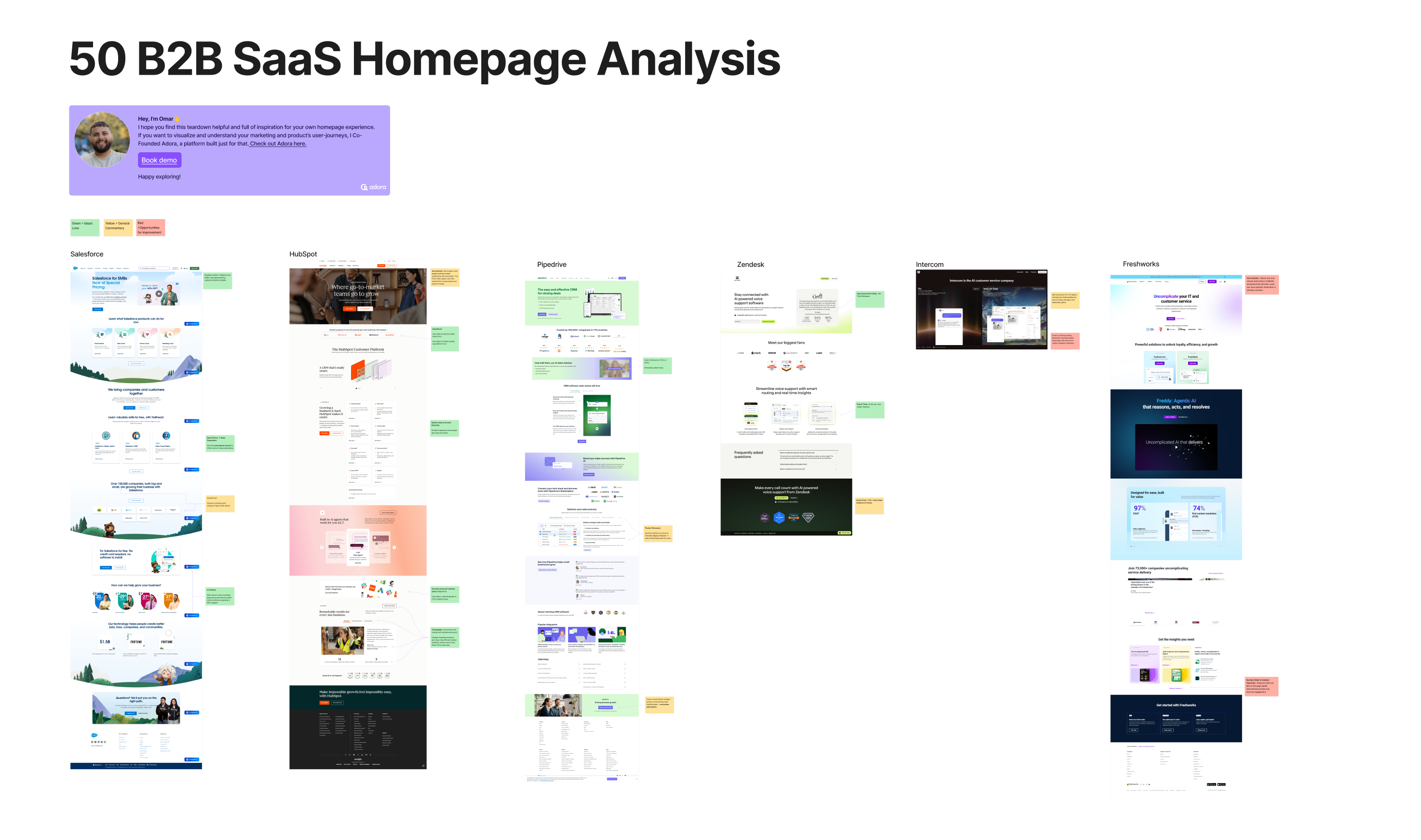
This teardown visualizes complete homepage flows from well-known B2B SaaS companies across categories like CRM, customer support, sales, analytics, and infrastructure.
Each homepage is reviewed section by section, from hero to footer, with notes on messaging clarity, layout choices, and conversion strategy.
What this homepage analysis includes
The teardown maps how B2B SaaS companies structure:
- Hero messaging and primary value proposition
- Subheadlines and supporting explanations
- Product visuals and interface previews
- Social proof and credibility signals
- Use case breakdowns and feature highlights
- Calls to action and conversion paths
- Pricing signals and objection handling
- Footer navigation and trust reinforcement
Seeing these pages side by side makes patterns obvious that are easy to miss when reviewing sites in isolation.
Common Patterns Across High-Performing B2B SaaS Homepages
Despite different markets and audiences, strong B2B SaaS homepages share consistent traits.
1. Clear value propositions above the fold
The best homepages immediately answer three questions:
- Who is this product for?
- What problem does it solve?
- Why it is better or different?
Strong examples avoid vague claims and focus on outcomes, not features.
2. Visual proof beats long explanations
Instead of long paragraphs, high-performing pages rely on:
- Product screenshots
- Short demo loops
- Annotated UI visuals
- Workflow diagrams
This reduces cognitive load and builds confidence faster.
3. Social proof appears early and often
Trust signals show up throughout the page, not just at the bottom:
- Customer logos near the hero
- Short testimonial quotes
- Usage metrics and credibility stats
- Recognizable brand endorsements
These elements reduce perceived risk for first-time visitors.
4. One primary call to action
Most effective pages guide users toward a single next step, such as:
- Start free trial
- Book a demo
- See the product in action
Secondary actions exist but do not compete visually with the primary CTA.
Where B2B SaaS Homepages Commonly Fail
The teardown also highlights recurring mistakes.
Overloaded messaging
Some pages try to speak to too many audiences at once, resulting in:
- Generic headlines
- Confusing sub-messages
- Weak differentiation
Clarity almost always outperforms completeness.
Feature-first storytelling
Pages that lead with feature lists instead of problems often struggle to connect emotionally with buyers. Users care about outcomes before capabilities.
Buried conversion paths
When CTAs are inconsistent or hidden too far down the page, visitors lose momentum and bounce.
Homepage Structure That Consistently Converts
Based on the analysis, a strong B2B SaaS homepage typically follows this flow:
- Clear hero message with outcome-focused headline
- Short explanation of who the product is for
- Visual demonstration of the product
- Social proof and credibility reinforcement
- Use cases or roles broken out clearly
- Feature highlights tied to real workflows
- Strong CTA repeated at natural stopping points
- Footer that reinforces trust and provides depth
Not every company uses the same layout, but successful pages respect this narrative arc.
Why Visual Homepage Teardowns Matter
Homepage reviews often focus on copy tweaks or design polish. Teardowns reveal the bigger picture.
By visualizing full pages side by side, teams can:
- Spot patterns across competitors
- Identify gaps in their own messaging
- Align marketing, product, and design teams
- Make homepage decisions based on evidence, not taste
This kind of analysis shifts conversations from opinions to structure.
How Adora Helps Teams Improve Homepage Performance
Adora makes it easy to visualize and analyze homepage journeys the same way you analyze onboarding or product flows.
With Adora, teams can:
- Map homepage sections and conversion paths
- Compare competitor messaging and structure
- Identify friction and drop-off points
- Align homepage changes with activation goals
- Treat the homepage as part of the product journey
Your homepage is often the first step in your onboarding experience. It deserves the same level of intentional design.
Related posts

Why We Built AI Product Insights
The story behind Adora's AI Insights, and why I think this is the future of how product teams operate.

Guide: How to audit your product journeys?
Your product is constantly evolving, and small decisions quietly add up. This is a step-by-step guide to auditing your product journeys, catching friction before it becomes churn, and keeping your whole team accountable to the end-to-end experience.

Data-driven off a cliff: why dashboards are dead
Dashboards are dead. Not because data doesn't matter. But because the way we've been accessing it was never actually built for the people making product decisions. Here's what went wrong, and what comes next.