
SaaS Onboarding Playbook
SaaS Onboarding Playbook
Why great onboarding is make-or-break for SaaS?
Most SaaS companies lose 75% of new users in week one.
👆That's not a retention problem. It's an onboarding problem.
You spend months or years building your product, weeks of marketing budget convincing someone to sign up, and then lose them before they even understand what you've built. It's brutal.
Improving your onboarding retention by as little as 5% can lead to more than more than a 25% increase in profit (Source: Bain & Co, Prescription for cutting costs).
But here's what I've learned from working on growth at Canva and now Co-Founding Adora: great onboarding isn't about showing users what your product does. It's about getting them to their first meaningful outcome as fast as possible.
What onboarding actually is
Think about the last time you tried a SaaS product or downloaded a new app. You had a specific problem you wanted to solve. You didn't care about features or tutorials. You wanted to know: can this product actually help me and do what it promises?
That's what onboarding needs to answer. Not through explanations, but through experience.
When we were scaling Canva globally, we saw this play out across markets. Users in Australia might sign up to create a presentation. Users in India might need a morning greeting card. Same product, completely different first experiences needed.
The goal isn't to teach users everything your product can do. It's to help them accomplish the one thing they came to do as quickly as possible.
Why most onboarding fails
I see two common mistakes:
The feature tour trap: Products that immediately throw users into a 10-step walkthrough of every button and menu. Users don't care about your feature set yet. They care about their problem and solving it.
The blank canvas problem: Products that drop users into an empty state with zero guidance. Freedom sounds nice, but it's paralyzing when you're new.
Growth expert, Elena Verna, talks about this in her growth work at Loveable, one of the fastest growing start ups in history. She emphasizes "time to value" as the critical onboarding metric. Not time to see features. Time to get actual value in the product.
What good onboarding looks like
The best onboarding I've seen does three things:
- Gets you doing, not watching. Duolingo doesn't explain how language learning works. It puts a simple translation exercise in front of you immediately. You're learning before you realize you started.
- Personalizes the path. Notion asks what you want to use it for before showing you anything. That one question completely changes your first experience.
- Celebrates small wins. Slack's little celebration when you send your first message isn't accidental. It's marking progress and building momentum.
The pattern? All three get users to a personalised meaningful outcome within minutes, not days.
The metric that matters
Forget feature adoption rates in week one. The question is simpler: did the user accomplish what they came to do and reach that ‘Aha moment’?
At Canva, we tracked "first design completion" as our north star onboarding metric. Because until someone finished and downloaded their first design, they hadn't actually gotten value from the product.
What's your equivalent? What's the earliest signal that a user got what they came for?
Thats your onboarding goal, work backwards from there.
Step by Step Guide For Onboarding (copy & paste)
Most teams approach onboarding backwards. They start with what they want to show users, not what users need to accomplish.
1. Understand your users objectives
To begin, you’ve got to know your users inside-out. What makes them tick? What problems are they trying to solve? To create an onboarding experience that wows, start with some user research and analysis:
- What do your users need, want, or hope to achieve with your product?
- What frustrations or roadblocks are they hitting?
- What competitors are they investigating in their search for solutions?
- Why would they choose your product over competitors?
To understand these objectives, research your users by conducting interviews, analysing your own user data, running surveys and researching similar products on the market. Consolidate these findings into a series of core user needs and objectives, to help guide your product and onboarding decisions.
2. Map your current user journey
Here's where most teams rely on gut feeling. "I think users get confused here." "This feature seems complicated."
Stop guessing. Map your journeys and watch what actually happens.
Start by documenting your current onboarding journey:
- Screenshot every step of your onboarding experience
- Pull the data from your analytics platform for each screen
- Overlay the numbers, drop-off rates, time spent, click patterns, completion rates by different cohorts (devices, countries, experiments)
- Annotate issues and areas of opportunity
You'll see immediately where users flow and where they stall.
Once you have this map, compare it against what users are trying to accomplish. The gaps between user intent and actual behavior? Those are your opportunities to improve.
P.S. If you’re building an onboarding experience for the first time skip this step and move to step 3.
3. Build the steps to your ‘Aha! moment’
Now that you understand what users want and where your current onboarding falls short, you can start building something better.
Every product has a moment where it clicks for users and they see value. The question is: do you actually know what that moment is?
For Dropbox, it was seeing a file sync across devices. For Slack, it was receiving your first message from a teammate. For Duolingo, it was completing your first lesson.
These weren't guesses. They were found in the data.
Here's how to find yours:
Look at your retained users. Pull a cohort of users who are still active after 30 days. What did they do in their first session that others didn't?
Compare against churned users. Now look at users who signed up but never came back. What actions did they skip or never complete?
Find the pattern. The actions that consistently show up in retained users but not churned users? That's your signal. That's the behavior that predicts long-term value.
Once you've identified this moment, reverse engineer your onboarding to get every new user there as quickly as possible. Remove steps that don't lead to it. Simplify anything that slows users down. Make this moment impossible to miss.
Your entire onboarding should have one goal: get users to experience your core value firsthand, as fast as possible.
4. Prototype a minimum viable onboarding journey
Now comes the hard part: restraint. You'll be tempted to show users everything. All your features, all your capabilities, all the clever things you built. Don't.
Your MVP onboarding has one job: get users to their ‘Aha! moment’. Strip out anything that doesn't directly contribute to that moment.
Here's how to build it:
Map the critical path. Write out the absolute minimum steps a user needs to take to reach their "aha moment." Map it in a way where you’re being as interactive as possible. Remember Duolingo, they get the user to complete a class. How can you make your onboard interactive so your user feel like they’re achieving a step towards their goal.
Choose your UI patterns wisely. Different patterns work for different moments:
- Interactive tour: Get users to engage with your product while having modales or tooltips explain step by step.
- Modals: Use sparingly for critical decisions early on, like "What do you want to create?"
- Tooltips: Point to specific features only when users need them in the flow. A tooltip before someone is ready to use a feature is just noise.
- Progress indicators: Show users how far they've come in the onboarding. Visible progress keeps people moving forward.
- Checklists: Help users see what's left without forcing a rigid order. Let them choose their path.
- Hotspots: Subtle visual cues that say "there's something here" without interrupting what users are doing.
Start with the simplest version. Build a rough prototype, with clickable mocks, to get the idea across. You're not designing the final experience yet. You're testing if the path actually works.
The goal? A straight line from sign-up to value. No detours, no nice-to-haves, no explaining features they haven't used yet.
5. Test with users
Your team knows your product too well. You can't see it through beginner eyes anymore.
Find people who match your target users but have never seen your product. Give them a task that matches their likely goal, "create your first design," "send your first message," “analyse your product dashboard”, whatever your core action is.
Then watch. Don't help. Don't explain. Don't jump in when they pause. Just observe.
What to look for:
- Where do they hesitate or look confused?
- What do they try to click that isn't clickable?
- What do they expect to happen that doesn't?
- Do they complete the task? How long does it take?
- Do they feel confident or frustrated at the end?
Run 5-7 of these sessions. You'll start seeing patterns, the same stumbling blocks showing up repeatedly. Those are your priorities.
Combine qualitative and quantitative. Watch users navigate your prototype, but also track the data. Time to completion, drop-off points, clicks per step. Both tell you different things.
The qualitative shows you why something isn't working. The quantitative shows you how big the problem is.
You'll learn more in five user tests than in fifty internal debates about what's "intuitive." Use what you learn to refine the journey before you build it into your product.
Use these insights to iterate the onboarding journey.
6. Build your journey
You've tested your prototype. You know what works. Now build it.
Start small. Don't launch to everyone at once. Roll out your new onboarding to 5-10% of new users first. This protects your core metrics while giving you real signal about what's working.
Watch what happens for a week or two. Are completion rates improving? Is time-to-value dropping? Are more users coming back for a second session?
If the data looks good, expand to 25%, then 50%, then everyone. If it doesn't, you've limited the damage and learned what needs fixing.
Gradual rollouts aren't just risk management. They're how you learn what actually works in production versus what worked in testing.
7. Measure what matters
Once your onboarding is live, track the metrics that tell you if it's actually working:
Completion rate: What percentage of users finish the onboarding flow? If it's below 60%, something is broken.
Time-to-value: How long does it take users to reach their first meaningful outcome? Shorter is almost always better.
Drop-off points: Where do users abandon the flow? That's where you need to investigate and improve.
Return rate: Do users come back for a second session? The best onboarding gets users to value so clearly that they want more.
These numbers tell you if your onboarding works. Not if it looks nice. Not if it follows best practices. If it gets users to value.
8. Iterate based on feedback
Your onboarding is never done.
Your product evolves. Your users change. New competitors emerge. What worked six months ago might not work today.
Keep gathering feedback. Keep analyzing the data. Keep running experiments to make the journey faster and clearer.
At Canva, we rebuilt onboarding three times as the product grew. Each version was better because we learned what actually mattered to users, not what we thought mattered.
The teams that win treat onboarding like a product, not a project. They continuously test, measure, and improve based on real behavior.
What's one thing in your onboarding that you know could be better but haven't prioritized? That's probably your next experiment.
Onboarding best practice (with examples)
Now that you know how to build your onboarding, here's what separates good from great.
1. Simple sign-up
Every field you add to sign-up is a chance for users to leave. Keep it minimal.
Ask for the absolute minimum to get someone into your product. Name and email? Fine. Job title, company size, phone number, and how they heard about you? That's an interrogation, not a sign-up.
Single sign-on makes this trivial. Let users sign in with Google, Apple, or Microsoft. They're already logged in, they don't need another password to remember, and you get them into your product in one click.
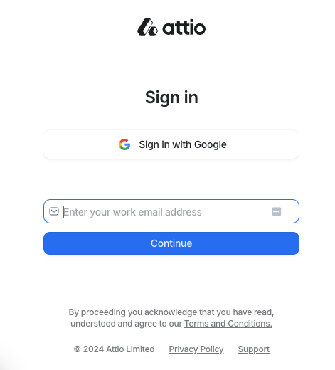
Example: Attio CRM
Click "Sign in with Google" and you're in. No forms, no password creation, no verification emails. If your team already uses Attio, you're automatically added to the right workspace. No duplicate accounts, no admin headaches.
2. Personalize the experience
Not everyone uses your product the same way. A marketing manager and a software engineer have different goals, different workflows, different definitions of success.
So why show them the same onboarding?
Ask one or two questions upfront to understand what someone is trying to do. Then tailor the experience to match. Different templates, different examples, different first actions.
But here's the rule: only ask if you're going to use the answer. Nothing frustrates users more than answering questions and then seeing a generic experience anyway. If you're not ready to personalize based on their input, don't ask for it.
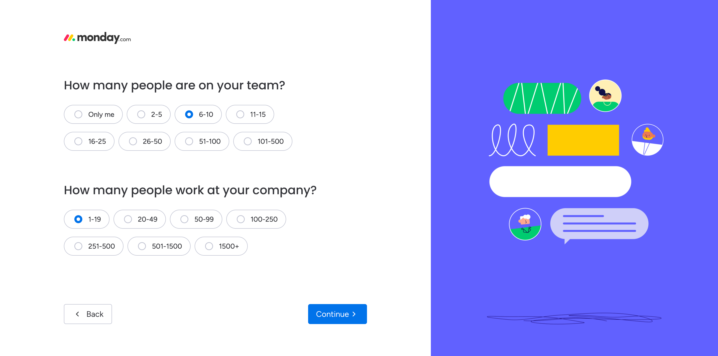
Example: Monday.com
Monday.com serves teams across marketing, engineering, HR, and operations. Their onboarding reflects this:
- Brief survey upfront asking about role, team size, and primary use case
- Dashboard pre-configured with relevant templates for that use case
- Tips and tutorials focused on the workflows that matter for that role
- Feature recommendations that match what similar users actually use
The result? A product manager sees project tracking. A marketer sees campaign management. Same platform, different entry points, faster time to value.
3. Create interactive product tours
The best onboarding gets users doing, not watching.
Interactive tours work when they're hands-on and focused. Guide users through one core workflow. Highlight the features they need right now, not everything your product can do. Keep each step bite-sized—one action, one outcome.
Make tours feel like progress, not homework. Checklists can work if they're short and celebrate completion. Tooltips work if they appear exactly when users need them, not before.
But here's what matters most: let users opt out. Some people want guidance. Others want to explore on their own. Forcing everyone through the same tour frustrates the explorers and wastes their time.
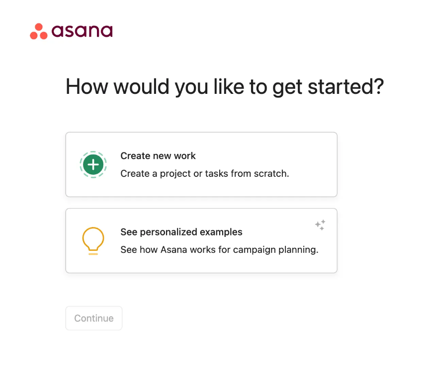
Example: Asana
Asana gives users two paths from the start:
- A quick self-guided tour for users who want to jump in and figure it out themselves
- An AI-powered personalized walkthrough for users who want more structure
The personalized version adapts based on role and use case. A project manager sees different workflows than a creative team lead. Same product, different entry points.
4. Minimise empty states
When users log in and see a blank screen, it can create uncertainty about what to do next.
Don't make new users start from nothing. Give them something to work with, templates, sample data, pre-filled examples. Show them what's possible before asking them to create from scratch.
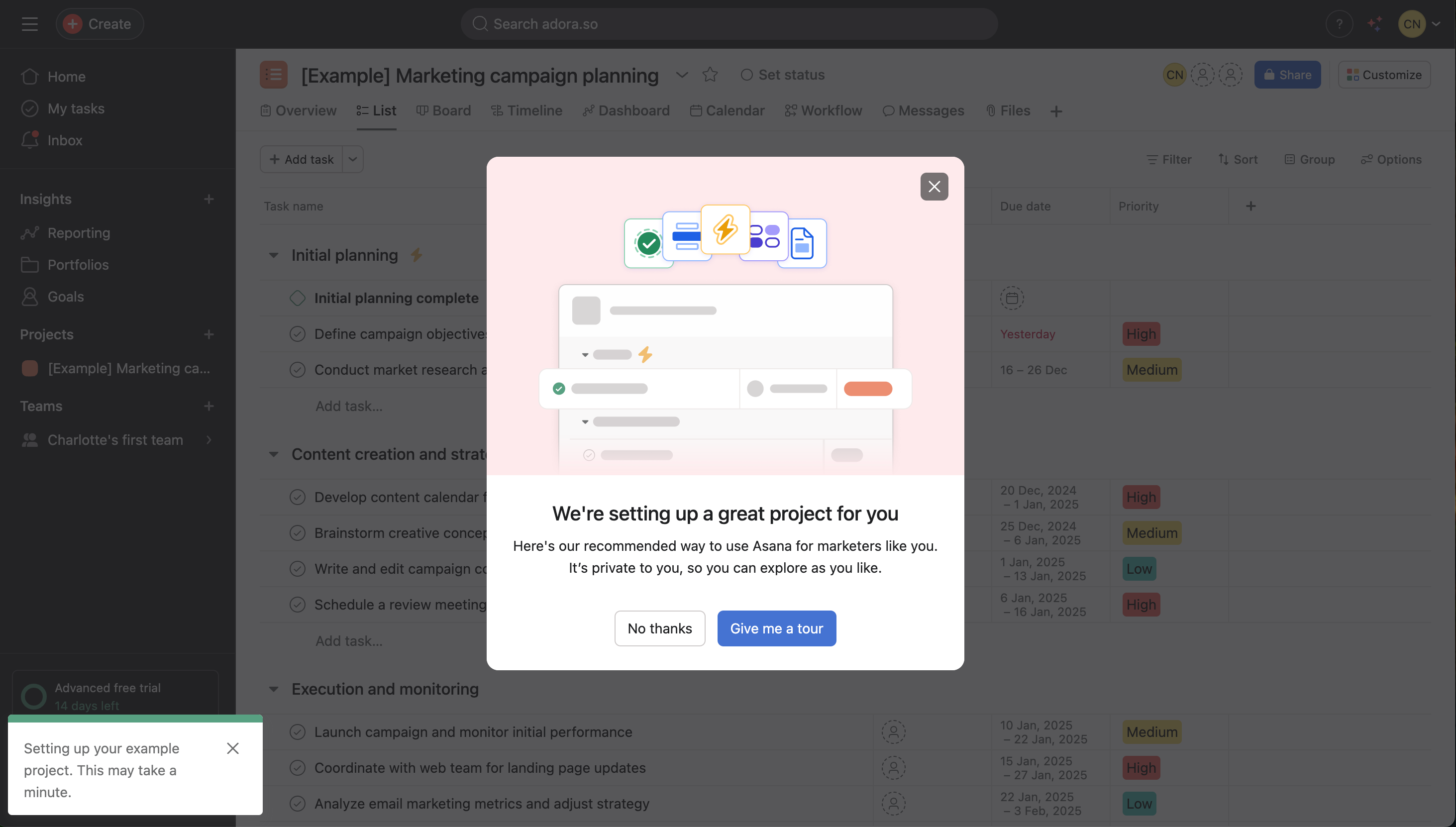
Example: Canva
Canva never shows you a blank canvas. Instead:
- Thousands of templates organized by what you're trying to create
- Guided design files that take you straight into the editor wto start designing with instructions
- Sample designs that show what's possible in seconds
This taps into something powerful: people value what they create themselves. By getting users designing immediately, even if they're just editing a template, Canva builds ownership and investment from the first session.
5. Get them hooked with variable content
People come back when they don't know exactly what they'll find, but know it will be relevant.
This is why social feeds work. Why Netflix keeps people browsing. Why analytics platforms become the daily source of truth. Variable rewards create curiosity.
In onboarding, this means showing users something new each time they return. Fresh content in their feed. New recommendations based on their behavior. Different tips or features highlighted. Progress milestones that unlock as they use the product.
The key is relevance. Random content isn't engaging. Content that feels personalized to their interests keeps them coming back.
Example: Tik Tok
TikTok asks about your interests during onboarding, then immediately customizes your feed. Every scroll reveals something new but relevant. You never know exactly what's next, but you know it's probably something you'll like.
The endless feed format amplifies this. There's always one more video. Always something you haven't seen.
6. Create Self-Service Resources
Users will get stuck. The question is whether they can unstick themselves or whether they leave.
Self-service resources keep users moving forward without waiting for support. A searchable help center, short tutorial videos, templates they can copy, chatbots (that work) and FAQs for common questions. Make them easy to find when users need them, not buried three clicks deep.
Example: Notion
Notion's self-service approach covers every learning style:
- Comprehensive help center with guides organized by feature and use case
- Template library so users can see working examples instead of starting from scratch
- Community forums where users share solutions and workflows
- In-app AI assistant that helps users build pages and learn features in context
- YouTube tutorials showing exactly how to accomplish specific tasks
- Real user stories demonstrating how teams actually use the product
Users can find answers however they prefer to learn, reading, watching, copying, or asking.
Don't make users hunt for help or wait for support. Give them the tools to solve their own problems, and they'll stay engaged instead of getting frustrated.
30 Onboarding Journeys
I’ve analysed 30 of the top PLG onboarding journeys to show you what works and what doesn’t work.
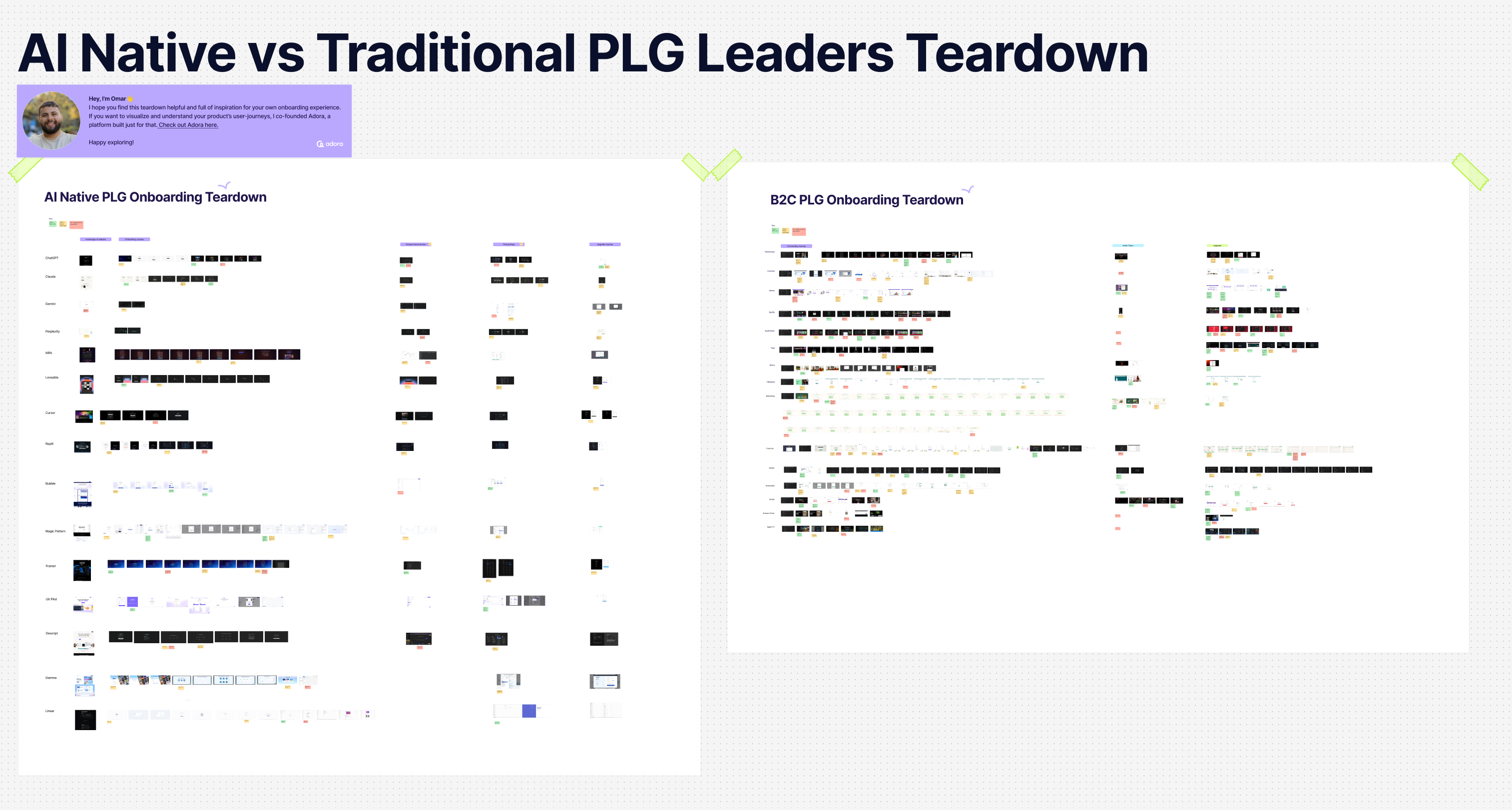
You’ll see the best practice patterns called out in here:
(Password: adora)
Onboarding growth experimentation
How to measure onboarding success?
You built a new onboarding journey. Now comes the real question: is it working?
Stop guessing. Track what matters.
Metrics to watch
Completion rate: What percentage of users finish your onboarding flow? If fewer than 60% are completing it, something's broken. Either it's too long, too confusing, or asking users to do things they don't care about yet.
Time-to-value: How long does it take users to reach that "aha moment" you identified? At Canva, we found users who completed their first design in under 10 minutes had 3x higher retention. That became our benchmark. What's yours?
Drop-off points: Where do users abandon the journey? That screen with a 40% drop-off? That's your problem. Dig into why. Is the step unclear? Too complicated? Take note and optimise it.
Activation rate: How many users complete your ‘Aha moment’ within their first session? This is your leading indicator. If users don't get value on day one, they're unlikely to come back on day two.
Return rate: Do users come back for a second session? The best onboarding doesn't just get users through a flow. It creates enough value that they want more.
Free to trial rate: What percentage of users take up a paid trial and what percentage to continue to pay once the trial elapses?
Keep experimenting
Your first version won't be perfect. That's fine. What matters is learning what works and what doesn't.
Run experiments on specific steps. Change one thing at a time. Test different copy. Try a different order. Try a different CTA. Remove a step entirely. Measure what happens.
Watch real users. Numbers tell you where things break. Watching users tells you why. Watch session replays daily. Run user tests every few months as your product evolves.
Look for patterns across segments. Does onboarding work better for certain user types? Different geographies? Different use cases? Those patterns reveal opportunities to personalize.
The teams that win don't build onboarding once and move on. They treat it like a product continuously improving based on what users actually do.
Congrats you have the onboarding tools to succeed 🎉
You now have the framework: understand what users are trying to accomplish, map where they're getting stuck, engineer a path to their first win, test it with real people, and keep improving based on what actually happens.
The difference between onboarding that converts and onboarding that loses 75% of users? It's not complexity. It's clarity. Get users to value fast, remove everything else, and measure what matters.
Related posts

Why We Built AI Product Insights
The story behind Adora's AI Insights, and why I think this is the future of how product teams operate.

Guide: How to audit your product journeys?
Your product is constantly evolving, and small decisions quietly add up. This is a step-by-step guide to auditing your product journeys, catching friction before it becomes churn, and keeping your whole team accountable to the end-to-end experience.

Data-driven off a cliff: why dashboards are dead
Dashboards are dead. Not because data doesn't matter. But because the way we've been accessing it was never actually built for the people making product decisions. Here's what went wrong, and what comes next.