
SaaS Pricing Pages to Sign Up Journeys
SaaS Pricing Pages to Sign Up Journeys
For most SaaS products, the pricing page is not just a comparison table. It is the moment of truth.
This is where intent turns into action or hesitation turns into drop-off. A strong pricing page does not end at pricing. It smoothly transitions users into a confident, low-friction sign up journey.
This teardown analyzes how leading SaaS companies design pricing pages and connect them to sign up flows, revealing what drives conversion and what silently kills it.
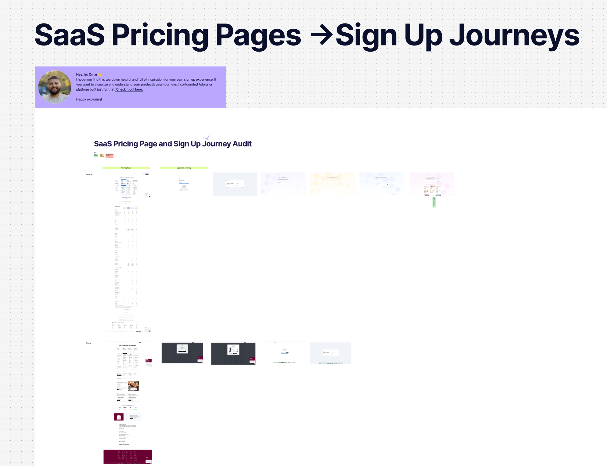
See the Figma teardown here!
This teardown maps full journeys from pricing page entry through account creation and early confirmation states.
By visualizing pricing pages next to sign up flows, it becomes clear how decisions made on pricing directly impact activation.
What this teardown includes
The analysis covers:
- Pricing page structure and layout
- Plan naming and positioning
- Feature comparison tables
- Free trial and freemium positioning
- CTA copy and hierarchy
- Transition from pricing to sign up
- Sign up form design and step count
- Confirmation, verification, and next-step screens
Seeing these journeys side by side reveals friction points that are often invisible when teams review pages in isolation.
Common Pricing Page Patterns That Convert
Across high-performing SaaS products, several patterns consistently appear.
1. One clear primary action
Strong pricing pages guide users toward a single primary action, such as:
- Start free trial
- Get started
- Create account
Secondary actions exist but are visually de-emphasized.
2. Friction-aware plan design
Successful pricing pages:
- Limit the number of plans
- Clearly highlight the recommended option
- Reduce decision fatigue with simple language
- Explain differences with outcomes, not just features
This prepares users mentally for the sign up step before they click.
3. Pricing clarity before commitment
High-converting pages answer key questions upfront:
- Is this free or paid
- When will I be charged
- Can I cancel easily
- What happens after the trial
Removing uncertainty reduces abandonment during sign up.
Where Pricing Pages and Sign Up Journeys Break Down
The teardown also exposes common failure points.
Pricing to sign up disconnects
Some products create a sharp shift between pricing and sign up by:
- Changing messaging tone
- Introducing unexpected steps
- Asking for information too early
This breaks momentum and increases drop-off.
Overloaded sign up forms
Long forms with unnecessary fields create friction at the worst possible moment.
Common issues include:
- Asking for company details before value is shown
- Requiring payment information too early
- Splitting simple sign ups into too many steps
Weak post-sign up direction
Many journeys end with a confirmation screen that provides no clear next step, leaving users unsure what to do next.
What High-Converting Sign Up Journeys Do Differently
The strongest sign up journeys feel like a continuation of the pricing page, not a new experience.
They typically:
- Reuse pricing language and plan context
- Reinforce the value of the chosen plan
- Minimize required inputs
- Show progress and expectations clearly
- Lead directly into onboarding or first value
This continuity builds confidence and reduces regret.
Why Pricing to Sign Up Teardowns Matter
Pricing pages are often owned by marketing, while sign up flows are owned by product. Teardowns help teams see the journey as a single system.
Visual audits like this enable teams to:
- Align pricing strategy with activation goals
- Identify friction across team boundaries
- Reduce drop-off at high-intent moments
- Make informed decisions about trials, paywalls, and gating
Conversion rarely fails on one screen. It fails across the journey.
Related posts

Why We Built AI Product Insights
The story behind Adora's AI Insights, and why I think this is the future of how product teams operate.

Guide: How to audit your product journeys?
Your product is constantly evolving, and small decisions quietly add up. This is a step-by-step guide to auditing your product journeys, catching friction before it becomes churn, and keeping your whole team accountable to the end-to-end experience.

Data-driven off a cliff: why dashboards are dead
Dashboards are dead. Not because data doesn't matter. But because the way we've been accessing it was never actually built for the people making product decisions. Here's what went wrong, and what comes next.