A/B Testing Analysis with Visual Analytics Overlay
A/B Testing Analysis with Visual Analytics Overlay
You ran an A/B test. Variant B won with 95% confidence. Conversion went up 2%. Your team celebrates.
But here's the question nobody asked: why did Variant B win? What did users actually do differently? Which part of the new design drove the change, and which parts were irrelevant? Without answering these questions, your next experiment is just another guess.
This is where most A/B testing analysis falls short. Teams get the "what" (which variant won) but miss the "why" (what behavioural differences drove the result). Visual analytics overlays solve this gap by showing you exactly how users interacted with each variant, not just the final numbers.
This guide walks through how to layer visual analytics onto your A/B testing analysis, with practical examples, a step-by-step process, and a framework for extracting insights that actually inform your next design decision.
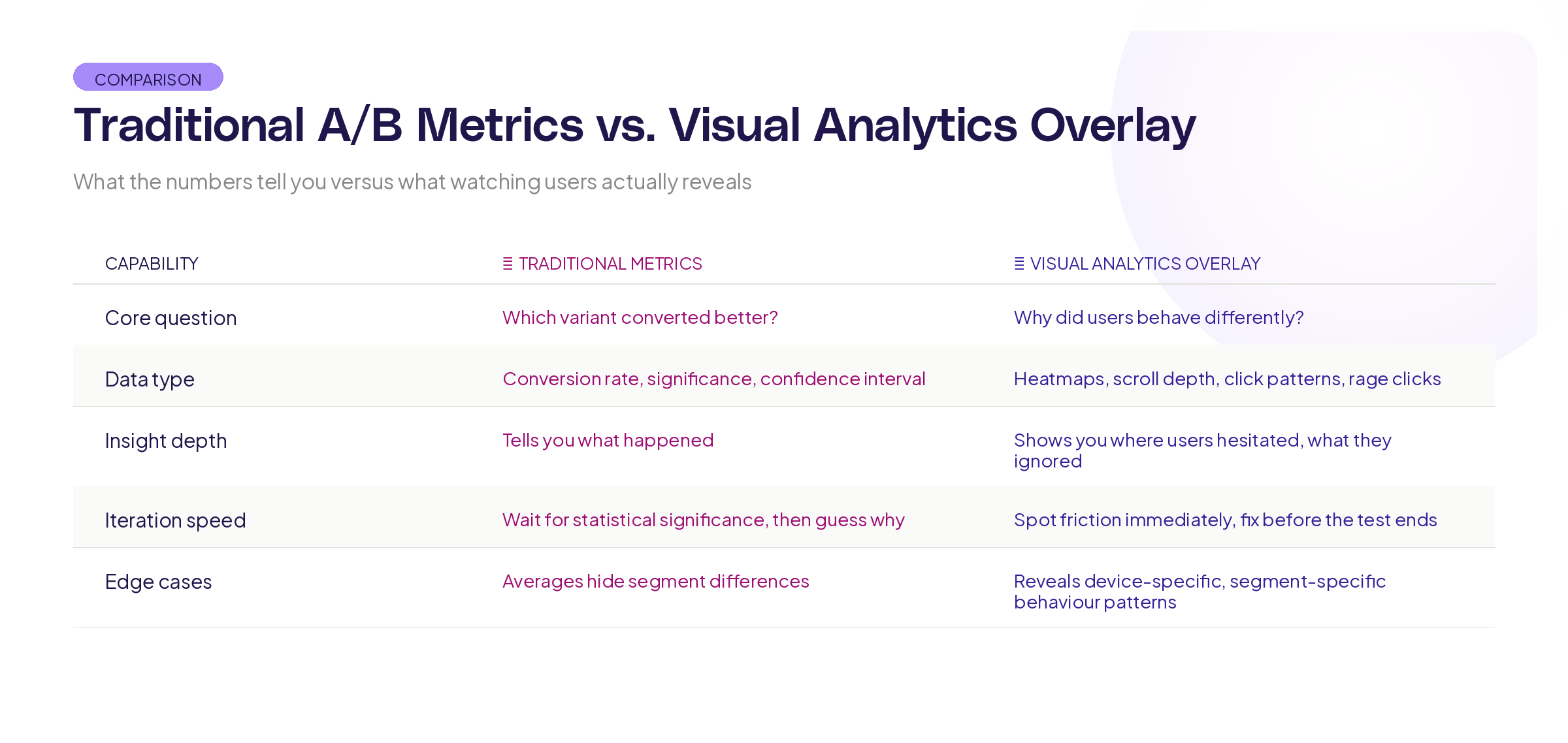
What traditional A/B testing analysis misses
Traditional A/B testing gives you a binary answer: variant A or variant B. That's useful, but it's incomplete.
Research from Harvard Business School on experimentation in business shows that the most valuable output of an experiment isn't the winner. It's the insight that explains why one approach outperformed the other. Without that insight, you've learned one fact ("this specific design converts better") but gained no transferable knowledge.
Here's what standard A/B testing analysis typically tells you: conversion rate difference, statistical significance, confidence interval, and maybe segment breakdowns. That's the scorecard. It tells you who won the game.
Here's what it doesn't tell you:
Where users hesitated. Did visitors in Variant A spend 30 seconds staring at the pricing section before bouncing? That's a signal that your pricing presentation needs work, regardless of which variant won.
What users ignored. Maybe you redesigned three sections, but users only interacted with one of them. The other two changes were wasted effort. Knowing this focuses your next iteration.
How scroll behaviour differed. If users in the winning variant scrolled 40% deeper into the page, that tells you something important about content engagement that conversion numbers alone can't reveal.
Where rage clicks happened. If users in the losing variant repeatedly clicked on elements that weren't interactive, you've found a usability problem, not just a conversion problem.
What visual analytics overlay actually means
Visual analytics overlay means layering behavioural data directly onto the product interface. Instead of looking at numbers in a spreadsheet, you see exactly where users clicked, scrolled, hesitated, and dropped off, mapped onto the actual design they were using.
For A/B testing analysis, this means you can compare not just conversion rates between variants, but the entire interaction pattern.
Think of it this way. Traditional A/B testing is like comparing the final scores of two football matches. Visual analytics overlay is like watching the game film. Both are useful, but the game film is where you learn what to do differently next time.
The practical application is straightforward. After your A/B test concludes, you don't just look at the conversion numbers. You review session recordings, interaction patterns, and scroll depth data for each variant side by side. The patterns you find explain the numbers.
Step-by-step process for using visual A/B testing analysis
Here's how to run A/B testing analysis that goes beyond the numbers.
Step 1: Define your analysis questions before the test ends
Don't wait until you have results to think about what you want to learn. Before your test concludes, write down 3-5 specific questions:
- Where do we expect users to interact differently between variants?
- Which specific design changes do we think will drive the conversion difference?
- What behaviour signals would indicate confusion or friction in either variant?
- Are there secondary metrics (scroll depth, time on page, interaction rate) that we should track alongside conversion?
Having these questions written down before you see the results prevents confirmation bias. You'll analyse what you planned to analyse, not just hunt for patterns that confirm the outcome you wanted.
Step 2: Collect the right data during the test
Your standard A/B testing tool handles conversion tracking. For visual analytics overlay, you also need:
Interaction data: Click maps, tap maps, and hover data for each variant. This shows you what users tried to interact with.
Scroll data: How far users scrolled in each variant. Did the winning variant get users deeper into the page, or did it convert them faster before they scrolled at all?
Session recordings: A sample of sessions from each variant. You don't need to watch every session. A representative sample of 50-100 per variant gives you enough to spot patterns.
Timing data: How long users spent on each section of each variant. Longer isn't always better, but it's always informative.
Research from the Baymard Institute on e-commerce usability shows that combining quantitative metrics with qualitative observation produces insights that neither approach generates alone.
Step 3: Compare interaction patterns, not just outcomes
Once the test concludes, start with the numbers (which variant won, by how much, at what confidence level) and then go deeper.
Pull up the interaction overlays for both variants side by side. Look for:
Click concentration differences. Are users in Variant B clicking on the primary call to action more directly, or are they exploring the page more before converting? Both outcomes are "wins," but they suggest very different things about the design.
Dead zones. Are there sections of either variant that received virtually no interaction? If you invested significant design effort in a section that users scroll past without engaging, that's a finding.
Friction points. Look for clusters of clicks on non-interactive elements (rage clicks), long pauses in specific areas, or repeated back-and-forth scrolling. These indicate confusion, and they often appear in the losing variant but can appear in both.
Step 4: Build your insight narrative
Raw data is useless without interpretation. For each test, write a brief insight summary that answers:
- Which variant won and by how much? (the standard part)
- What behavioural differences explain the result? (the new part)
- What design principles does this confirm or challenge? (the transferable part)
- What should we test next based on what we learned? (the forward-looking part)
This narrative is what makes experimentation compound over time. Without it, each test is an isolated event. With it, each test builds on the last.
Step 5: Share findings visually
When you present A/B test results to stakeholders, don't just show the conversion chart. Show the overlays.
Research from MIT's Senseable City Lab on data visualisation consistently demonstrates that spatial, contextual representations of data are more memorable and more actionable than abstract charts. Showing stakeholders a heatmap overlay on the actual design is more persuasive and more useful than a bar chart showing a 12% lift.
Patterns you'll find
After running dozens of visually analysed A/B tests, certain patterns show up repeatedly.
The "wrong winner" pattern. The variant with higher conversion actually has worse engagement in most sections. It wins because of one specific change (like button placement or copy) while the rest of the redesign had no effect or even hurt. Without visual analysis, you'd credit the entire redesign with the win.
The "hidden friction" pattern. The winning variant still has significant usability problems, but they're offset by improvements elsewhere. Visual analysis reveals these problems so you can fix them in the next iteration, rather than shipping a winner that's actually leaving performance on the table.
The "engagement versus conversion" pattern. Users in one variant engage more deeply (more clicks, more scroll depth, more time on page) but convert less. This often means the content is interesting but the conversion path is unclear. The variant with less engagement but more conversion has a cleaner path to the goal.
The "segment surprise" pattern. Visual overlays reveal that desktop and mobile users interact with the same variant in completely different ways. The overall winner might be losing for one segment. Without visual analysis by device, you'd miss this entirely.
Building this into your experimentation workflow
Visual A/B testing analysis shouldn't be an extra step bolted onto your existing process. It should be woven in.
Before the test: Define your behavioural hypotheses alongside your conversion hypothesis. "We believe Variant B will increase signups by 10% because users will find the CTA faster" gives you something specific to verify with visual data.
During the test: Make sure your visual analytics are tracking both variants. Set up session recordings and interaction tracking from day one, not as an afterthought when the results come in.
After the test: Spend equal time on the visual analysis as you spend on the statistical analysis. If your team spends an hour reviewing conversion numbers but zero minutes reviewing interaction patterns, you're leaving the most valuable insights on the table.
Quarterly: Review your insight narratives from the past quarter. Are patterns emerging? Are certain design principles consistently confirmed? This meta-analysis is where experimentation becomes a competitive advantage, not just a validation tool.
The Information Architecture Institute has published guidelines on integrating qualitative and quantitative data in design research that align closely with this approach.
Tools and setup
To run visual A/B testing analysis, you need your A/B testing tool paired with a visual analytics layer. Most teams already have the first piece. The second piece is what turns numbers into understanding.
Your visual analytics setup should capture: click and interaction maps, scroll depth tracking, session recordings, and timing data. Critically, it needs to segment this data by experiment variant so you can compare behaviour between groups, not just aggregate it.
At Adora, we think about this as overlay analytics, because the most useful behavioural data is the data you can see layered directly onto the interface your users experienced. When the data lives in a separate dashboard disconnected from the design, the insights get lost in translation.
Key takeaways
A/B testing analysis that stops at conversion numbers wastes most of the insight your experiments generate. Here's what to take forward:
Define behavioural questions before the test ends. Know what you're looking for so you're not just hunting for patterns after the fact.
Compare interaction patterns, not just outcomes. Click maps, scroll behaviour, and session recordings show you why variants perform differently.
Build an insight narrative for every test. The narrative is what makes knowledge compound across experiments.
Share findings visually. Showing stakeholders an overlay on the actual design is more persuasive and more useful than abstract charts.
Want to see your A/B test variants through the lens of real user behaviour? Try Adora free and layer visual analytics directly onto your experiments.
Related posts

Why We Built AI Product Insights
The story behind Adora's AI Insights, and why I think this is the future of how product teams operate.

Data-driven off a cliff: why dashboards are dead
Dashboards are dead. Not because data doesn't matter. But because the way we've been accessing it was never actually built for the people making product decisions. Here's what went wrong, and what comes next.

SaaS Pricing Pages to Sign Up Journeys
This teardown analyzes SaaS pricing pages and their connected sign up journeys. Learn how leading SaaS companies design pricing, CTAs, and sign up flows that reduce friction and increase conversion.