Best product analytics tools for SaaS teams in 2026
Best product analytics tools for SaaS teams in 2026
Best product analytics tools for SaaS teams in 2026
Let's be honest. You probably have more analytics tools than you're actually using.
Most teams waste thousands per month on product analytics platforms that don't fit how they work. They're either paying enterprise prices for features nobody touches, or they're patching together free tools that can't answer the questions that actually matter.
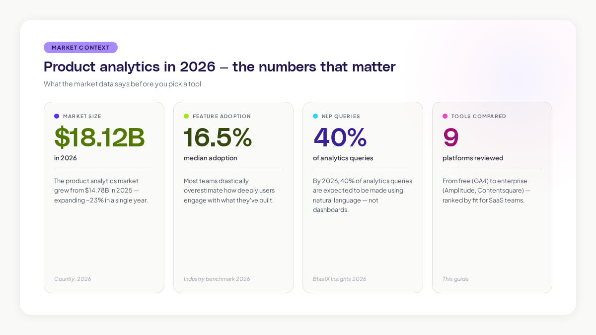
The product analytics tools market is growing fast. The market grew from $14.78 billion in 2025 to $18.12 billion in 2026, and it's expected to reach $30.80 billion by 2034. But more options doesn't mean better options for your team.
This guide walks you through the best product analytics tools for SaaS in 2026. We'll focus on what actually matters: can it track the behavior you care about? Can your team find the answers without waiting for an analyst? And does it integrate cleanly with your existing stack?
Why your SaaS team needs product analytics tools
Your product analytics tool is the bridge between what users do and what you build next.
Without it, you're guessing. You're making roadmap decisions based on the loudest customer request, not on what drives retention or revenue. You're leaving expansion revenue on the table because you don't know which features actually matter to your users.
Product analytics tools capture and analyze user behavior inside your product. Unlike traditional web analytics that tells you where traffic comes from, product analytics shows you what users actually do once they're inside. Which features do they use? Where do they get stuck? Who's about to churn?
Here's the thing: your median user adoption rate for core features is probably around 16.5%. Most teams drastically overestimate how deeply users engage with what they've built.
What changed in product analytics in 2026
The biggest shift is AI becoming table stakes, not a novelty feature.
In 2024, AI in analytics tools was experimental. By 2026, every serious platform is shipping natural language query, predictive analysis, and automated insights.
By 2026, 40 percent of analytics queries are expected to be made using natural language. Your product manager stops using dashboards and just asks, "Why did new user retention drop last week?" The platform answers with patterns, not just numbers.
The second shift is toward warehouse-native tools. If you're running on Snowflake or BigQuery, tools connect directly to your data warehouse instead of creating a separate database.
The third shift is impact analysis. A/B testing is old news. Now you're looking at tools that use causal inference to answer whether a feature change actually drove conversions or if it was something else.
The right tool depends on how your team works
This matters more than the feature list.
Before you evaluate tools, ask yourself:
- Who's using this tool? (Just product managers? The whole team? Customer success?)
- What decisions do you need to make with this data?
- How fresh does the data need to be?
- Do you need to connect to a data warehouse?
- Is ease of use more important than feature depth?
- Do you need session replay and heatmaps, or is event tracking enough?
These answers narrow down your options fast.
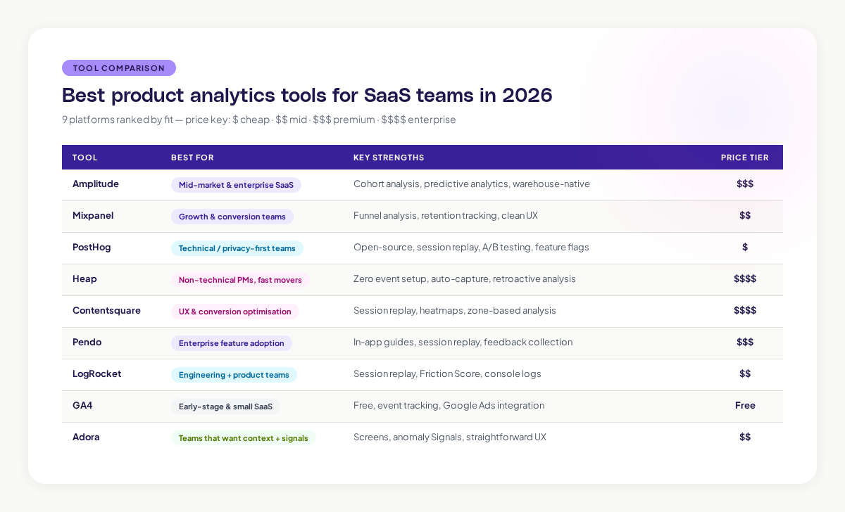
Amplitude
Amplitude is the market leader for SaaS product analytics. It's built for teams that need to understand user journeys at scale.
What it's good at: Amplitude excels at showing you the paths users take through your product. You can build complex user flows, identify high-value segments, and predict which users are likely to upgrade or churn. The funnel analysis is strong. The cohort segmentation tools are sophisticated.
Who it's for: Product teams at mid-market and enterprise SaaS companies. Teams that have dedicated analytics people.
Best features: Advanced cohort analysis, predictive analytics, user journey mapping, integration with data warehouses.
Weak spots: It's not the cheapest option. It has a learning curve. It's overkill for small teams with straightforward questions.
Mixpanel
Mixpanel is built around funnels and retention. It's the tool to choose if you're obsessed with understanding why users drop off.
What it's good at: Mixpanel's funnel analysis shows you exactly where users abandon your flow. The retention reports help you understand whether changes you make actually stick. Its event tracking is clean and the interface is designed to help non-technical people ask questions.
Who it's for: Growth teams. Product teams focused on conversion. Companies that care deeply about retention metrics.
Best features: Powerful funnel visualization, retention tracking, cohort analysis, A/B testing.
Weak spots: Not as strong at user journey mapping as Amplitude. The enterprise features are expensive.
PostHog
PostHog is the open-source option. You can self-host it on your infrastructure if data privacy is a hard requirement.
What it's good at: PostHog bundles product analytics, session replay, feature flags, and A/B testing into one platform. You're not stitching together five different tools. The pricing is transparent and per-feature.
Who it's for: Engineering-first teams. Companies with privacy requirements. Teams that want to avoid vendor lock-in.
Best features: Session replay built-in. Feature flags for product testing. Affordable. Transparent pricing.
Weak spots: The analytics features are solid but less sophisticated than Amplitude or Mixpanel. Self-hosting requires infrastructure knowledge.
Heap
Heap automatically captures every user action once you install it. No event tracking setup required.
What it's good at: If you hate configuring event schemas, Heap removes that friction. It retroactively analyzes actions you didn't plan to track. The onboarding is fast.
Who it's for: Small teams that don't have analytics engineers. Companies that want to move fast without infrastructure overhead.
Best features: Zero event instrumentation required. Session replay. Retroactive analysis.
Weak spots: No event tracking setup means you might track too much or miss important context. Less control over your data.
Contentsquare
Contentsquare brings together session replay, heatmaps, zone-based analytics, and product analytics. It's strong if you care about user experience optimization.
What it's good at: Session replay with intelligent filtering. Heatmaps show where users click, scroll, and look. Zone-based analysis lets you see how specific page areas perform.
Who it's for: Product teams focused on UX. Companies optimizing conversion funnels.
Best features: Session replay, heatmaps, conversion analysis, user journey tracking.
Weak spots: Expensive. Overkill for teams that just need event analytics.
Pendo
Pendo combines product analytics with in-app guidance and feedback collection. It's built for teams that want to drive adoption alongside understanding adoption.
What it's good at: Session replay with unlimited, intelligently filtered capture. In-app guides for onboarding. Feedback tools to understand why users aren't adopting features.
Who it's for: Enterprise SaaS teams. Companies focused on feature adoption and onboarding.
Best features: Session replay, in-app guides, feedback collection, adoption analytics.
Weak spots: You're paying for features you might not use. The UI can feel overwhelming.
LogRocket
LogRocket is built for engineering and product teams that need both analytics and session replay.
What it's good at: Session replay with a lightweight SDK. The Friction Score identifies where users struggle most. Console logs and network data give you debugging information alongside usage data.
Who it's for: Teams where engineers care about user behavior. Companies debugging performance issues.
Best features: Session replay, Friction Score, console logging, network monitoring.
Weak spots: Not as strong at complex funnel analysis or retention cohorts as Amplitude or Mixpanel.
Google Analytics 4
Google Analytics 4 is free and already installed on most websites. It's improved significantly for product analytics.
What it's good at: Event-based tracking. Deep integration with other Google products. The price is right.
Who it's for: Small SaaS teams. Early-stage startups. Teams that need basic funnel and retention tracking.
Best features: Free, widely understood, integrates with Google Ads and other Google products.
Weak spots: Not as sophisticated as paid tools. Session replay is limited. Cohort analysis is basic.
Adora
Adora is built to solve the problem we mentioned at the start: most teams can't actually use the analytics tools they pay for.
Adora uses Screens to show you exactly what happened in your user's session. Unlike other tools that bombard you with event lists, Screens gives you the full context: what was the user trying to do? What did they see? Where did they get stuck?
Adora's Signals tell you which moments matter. If 1,000 users saw a broken feature and 900 of them never came back, Signals highlights that anomaly so you don't miss it. It's not just showing you data, it's showing you what to care about.
Who it's for: Product teams that find other tools overwhelming. Teams that want the "why" alongside the "what."
Best features: Screens (contextual session views), Signals (anomaly detection), straightforward UX, integrates with data warehouses.
How to choose the right product analytics tool
You need to answer three questions.
First: What are you trying to measure? If it's activation, you care about funnels. If it's retention, you care about cohorts. If it's expansion, you care about feature adoption. Different tools are stronger at different questions.
Second: Who's going to use it? If it's just product managers, you can handle a more complex tool. If it's the whole team, you need something intuitive.
Third: What data do you already have? If you're running on Snowflake or BigQuery, warehouse-native tools give you fresher data.
The mistake most teams make is choosing based on the feature list. You don't need every feature. You need the features you'll actually use.
Setting up product analytics for real adoption
Installing a tool is different from getting your team to use it.
Here's what actually works:
Start with the question, not the tool. Write down three decisions your team needs to make this quarter. Can your analytics tool answer them? If it takes more than five minutes to get the answer, the tool's wrong for you.
Make dashboards for shared questions. Not one dashboard with 47 metrics. Three dashboards: one for activation, one for retention, one for expansion. Keep them simple.
Assign an owner. Someone on the team needs to own the tool. They learn it deeply. They build the core dashboards. They answer questions for everyone else.
Set a weekly cadence. Every week, your team looks at one metric and discusses what changed and why.
The future of product analytics
The gap between having data and acting on data is the real problem.
You can collect infinite amounts of data. You can ask AI for insights. But you still need to know what to do about it. The tools that win are the ones that surface the right data at the right time and make it obvious what you should care about.
Look for tools that show you context, not just numbers. Highlight anomalies automatically. Integrate with your existing tools. Work for the whole team, not just analysts.
The best product analytics tool for your SaaS team is the one your team will actually use. That usually means simplicity over features, context over metrics, and answers over data.
Related posts

Why We Built AI Product Insights
The story behind Adora's AI Insights, and why I think this is the future of how product teams operate.

Data-driven off a cliff: why dashboards are dead
Dashboards are dead. Not because data doesn't matter. But because the way we've been accessing it was never actually built for the people making product decisions. Here's what went wrong, and what comes next.

SaaS Pricing Pages to Sign Up Journeys
This teardown analyzes SaaS pricing pages and their connected sign up journeys. Learn how leading SaaS companies design pricing, CTAs, and sign up flows that reduce friction and increase conversion.