Onboarding Documentation: Auto-Updated Walkthroughs
Onboarding Documentation: Auto-Updated Walkthroughs
Onboarding Documentation: Auto-Updated Walkthroughs
Your onboarding documentation is probably wrong right now. Not completely wrong. Just enough to confuse the new user who's following it step by step and wondering why the button on their screen doesn't match the screenshot in your guide.
A study by Consortium for Service Innovation found that 60% of help content in SaaS products is outdated at any given time. Not because teams are lazy. Because products move faster than anyone can manually update docs.
This guide shows you how to build help centre onboarding documentation that stays accurate automatically, so new users get the right instructions every time. You'll get a practical framework, real examples, and a system for keeping your walkthroughs current without turning your team into full-time doc writers.
The cost of outdated onboarding docs
When your onboarding documentation doesn't match the actual product, three things happen. None of them are good.
First, new users lose trust. They followed the steps, something didn't work, and now they're questioning whether the rest of your documentation is reliable. Usability research from Jakob Nielsen shows that users form trust judgments about digital products within seconds, and a single bad experience can reset that trust to zero.
Second, your support team absorbs the impact. Every confused user who hits a mismatch between docs and product becomes a support ticket. For teams running at scale, this adds up fast. If 200 new users per month hit the same outdated screenshot, that's 200 unnecessary conversations your support team is having.
Third, activation drops. Research from Wyzowl shows that 86% of users say they'd be more likely to stay loyal to a business that invests in onboarding content. When that content is wrong, users don't just get frustrated. They leave.
What good onboarding help docs look like
Before we get into the auto-update system, let's agree on what the end product should look like.
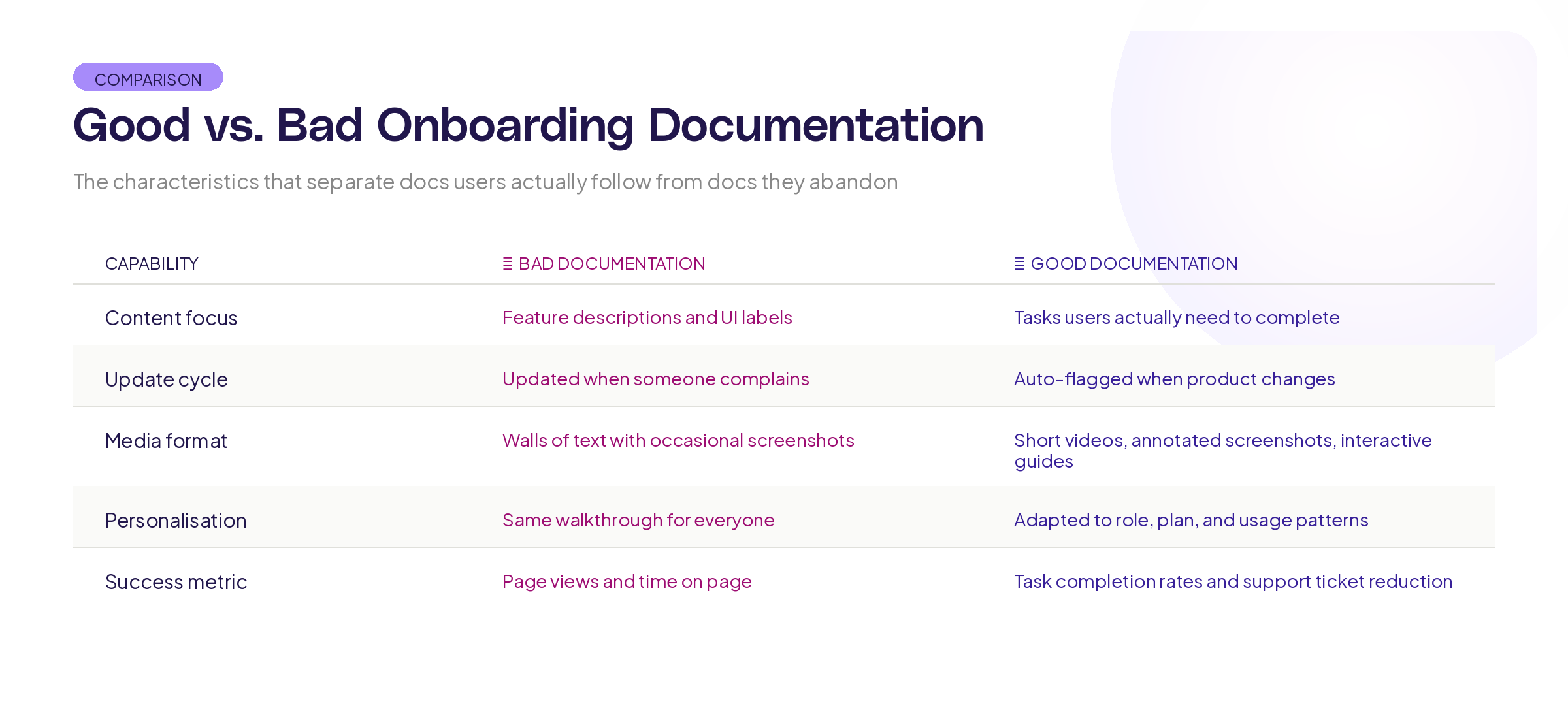
Good onboarding documentation is task-based, not feature-based. Users don't want to know everything your product can do. They want to know how to accomplish the specific thing they signed up to accomplish. "How to create your first project" beats "Project Module Overview" every time.
It follows the user's actual path. Not the path your team imagined during planning, but the path users actually take. This means your docs should mirror the real sequences of actions, including the detours and common mistakes.
It's visual. Walls of text don't work for instructions. Screenshots, annotated images, and short walkthrough recordings reduce time-to-completion dramatically. Research from the Technical Communication Body of Knowledge shows that visual instructions are processed 60,000 times faster than text-only instructions.
It's layered. Beginners need the basics. Power users need advanced options. Great onboarding docs let users choose their depth without forcing everyone through the same path.
Building living onboarding documentation
Manually keeping docs in sync with a product that ships updates every week is a losing battle. Here's a framework for building onboarding documentation that maintains itself.
Pillar 1: Connect docs to the live product
The single biggest improvement you can make is connecting your documentation to the actual product interface. Instead of taking screenshots manually and pasting them into a doc, use tools that capture the current state of your UI automatically.
This means your onboarding walkthrough for "how to set up your first dashboard" always shows what the dashboard setup screen looks like right now, not what it looked like when someone wrote the guide six months ago.
At Adora, this is exactly why we built living product docs. When your documentation is connected to actual product screens, it stays current because the source of truth is the product itself, not a static document someone has to remember to update.
Pillar 2: Use task flows, not feature lists
Structure every onboarding document around a specific user task with a clear outcome.
Here's the template:
Task title: What the user is trying to accomplish (e.g., "Set up your first automated report")
Prerequisites: What the user needs before starting (e.g., "You'll need admin access and at least one data source connected")
Steps: Numbered, specific, one action per step. Each step includes what the user should see after completing it. This "expected result" line is critical because it lets users verify they're on track.
Troubleshooting: The 2-3 most common things that go wrong at this stage and how to fix them.
Next step: Where to go after completing this task.
This structure works because it matches how users think. They don't think in features. They think in tasks.
Pillar 3: Build a review trigger system
Even with auto-updating screenshots, the text around them can drift. Build triggers that automatically flag docs for review.
Ship trigger: Every time a feature ships that touches a documented workflow, the relevant doc gets flagged for review. This can be as simple as a tag in your project management tool that links features to their associated docs.
Time trigger: Set a maximum age for every doc. 90 days is a good default. After 90 days without a review, the doc gets flagged regardless of whether anything changed. Products evolve in ways that aren't always captured in release notes.
Usage trigger: If a specific doc has high traffic but also high support tickets for the same topic, something is wrong. Flag it for immediate review.
Pillar 4: Measure doc effectiveness
You can't improve what you don't measure. Track these metrics for your onboarding documentation:
Task completion rate. Of the users who start a walkthrough, how many finish it? If completion drops off at step 4, something about step 4 is broken.
Time to completion. How long does it take users to finish the walkthrough? If your 5-step guide takes 45 minutes, either the steps are too complex or the documentation is unclear.
Support ticket correlation. Are users who read your onboarding docs filing fewer support tickets than users who don't? If there's no difference, your docs aren't doing their job.
Activation correlation. Do users who complete onboarding walkthroughs activate faster? This is the metric that proves your documentation has business value, not just support value.
Keeping it up to date
The way you write your documentation determines how quickly it goes out of date. Here are practical rules.
Describe actions, not locations. Instead of "Click the blue button in the top-right corner," write "Click 'Create New Project.'" Buttons move. Labels are more stable. And if a label changes, it's easier to find-and-replace across your docs.
Avoid exact counts and specific UI descriptions. Instead of "You'll see five tabs at the top of the page," write "Select the Settings tab." The number of tabs might change. The name of the tab you need is what matters.
Use relative language for navigation. "Navigate to your project settings" is more durable than "Click the gear icon next to your project name, then select Settings from the dropdown." The destination stays the same even when the path to get there changes.
Version your docs visibly. Put a "Last verified" date on every doc. Users can instantly see if the guide might be outdated, and your team has a visual reminder of what needs review.
What tech stack do you need
You don't need a complex toolchain to build self-updating onboarding docs. But you do need the right pieces.
A documentation platform that supports both text and embedded media. Your docs need to handle screenshots, GIFs, and ideally interactive walkthroughs. Look for platforms that let you embed dynamic content rather than static images.
A screen capture system that connects to your live product. Manual screenshots are the number one reason docs go stale. Automate this layer and you solve 70% of the problem. The Product-Led Alliance has documented how leading SaaS companies use automated screen capture to keep documentation current.
A notification system that flags docs for review when related features ship. This doesn't need to be fancy. A shared spreadsheet linking feature names to doc URLs, combined with a process that checks this list every sprint, is enough to start.
An analytics layer that tells you which docs users actually use and where they get stuck. Without this data, you're guessing about what to improve.
Common mistakes to avoid
Writing all your docs at once during a "documentation sprint." This creates a batch of content that all goes stale at the same time. Instead, write docs as features ship and build the review cycle into your ongoing process.
Assuming your product team will keep docs updated. They won't. Not because they don't care, but because it's not their primary job. Build systems and triggers that make the work visible and assign clear ownership.
Making walkthroughs too long. If your onboarding walkthrough has 20 steps, break it into smaller task-based guides. Research on cognitive load from Sweller et al. shows that people can hold about 4-7 items in working memory at once. Each walkthrough should cover one task with 5-8 steps maximum.
Ignoring mobile and responsive layouts. If your product works on mobile, your docs need mobile screenshots too. A desktop screenshot is useless to someone trying to follow instructions on their phone.
Key Takeaways
Onboarding documentation breaks down when it's treated as a one-time writing project instead of a living system. Here's what to take away:
Connect your docs to the live product so screenshots and walkthroughs stay current without manual updates.
Structure everything around user tasks, not feature lists. People think in problems and goals, not modules and menus.
Build review triggers (ship, time, and usage-based) so outdated content gets flagged before users find it.
Measure doc effectiveness through task completion rates, support ticket correlation, and activation metrics.
Want to see how teams build documentation that stays in sync with their product automatically? Explore Adora's living product docs and see the difference a connected system makes.
Related posts

Why We Built AI Product Insights
The story behind Adora's AI Insights, and why I think this is the future of how product teams operate.

Data-driven off a cliff: why dashboards are dead
Dashboards are dead. Not because data doesn't matter. But because the way we've been accessing it was never actually built for the people making product decisions. Here's what went wrong, and what comes next.

SaaS Pricing Pages to Sign Up Journeys
This teardown analyzes SaaS pricing pages and their connected sign up journeys. Learn how leading SaaS companies design pricing, CTAs, and sign up flows that reduce friction and increase conversion.