Product Activation Metrics: Optimizing the First Experience
Product Activation Metrics: Optimizing the First Experience
The first mile of your product is where you win or lose users. A new user signs up with a specific problem in mind and a limited amount of patience. If they reach their first moment of value quickly, they stick around. If they do not, they leave and rarely come back.
Product activation metrics measure how effectively your product delivers that first value moment. Getting these metrics right is critical because activation is the strongest leading indicator of retention, expansion, and ultimately revenue.
This guide covers which product activation metrics actually matter, how to measure them accurately, and how journey data helps you optimize the activation experience.
What product activation actually means
Activation is the moment a user first experiences the core value your product delivers. This is not the same as "first login" or "completing onboarding." It is the moment the user thinks: "This is useful. I will come back."
For different products, activation looks different:
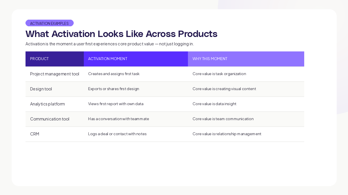
The common thread: activation happens when the user does the thing the product was built for, using their own data or context.
Research from Mixpanel's Product Benchmarks Report found that the median SaaS product activates only around 17% of signups within the first week. That means the vast majority of new users leave before experiencing value. This is the biggest growth problem most products face.
The five activation metrics that matter
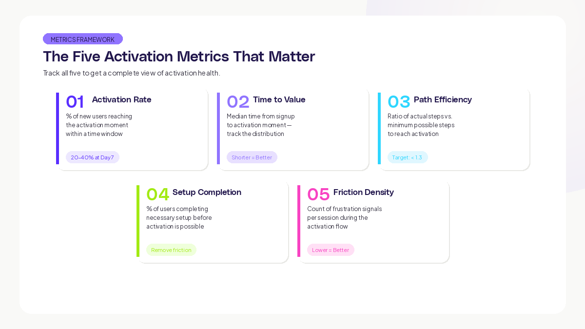
1. Activation Rate
Definition: The percentage of new users who reach the defined activation moment within a specific time window.
Formula: (Users who reach activation moment / Total new signups) x 100
Time windows to track: Day 1, Day 3, Day 7, Day 14, Day 30
Benchmarks: According to Lenny Rachitsky's analysis of SaaS activation, good activation rates for B2B SaaS products range from 20-40% at Day 7. Top-performing products hit 50%+.
This is your headline metric. Every optimization should move this number.
2. Time to Value (TTV)
Definition: The median time from signup to activation moment.
Why it matters: Even if your activation rate is decent, a long TTV means users are struggling to reach value. Shorter TTV correlates with higher activation rates and stronger retention.
What to measure: Track the distribution, not just the median. If your median TTV is 4 minutes but 30% of users take over 30 minutes, that tail is where you are losing people.
Here is what this looks like in practice: imagine a collaboration tool where the median time-to-value looks healthy at first glance. But the distribution is bimodal. One group activates quickly because they know what they want to do, while another group takes far longer because they are exploring without clear direction. The slow group retains at significantly lower rates. Fixing the exploration experience by giving those users clearer guidance can dramatically shorten their time-to-value and improve retention.
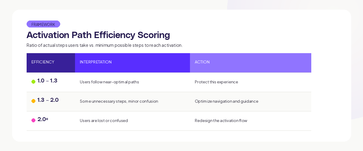
3. Activation Path Efficiency
Definition: The ratio of actual steps users take to reach activation versus the minimum possible steps.
Why it matters: High inefficiency means users are wandering, backtracking, or taking detours on the way to value. These are concrete opportunities to simplify.
How to measure: Use journey data to count the screens and actions users visit between signup and activation. Compare to the shortest possible path.
4. Setup Completion Rate
Definition: The percentage of users who complete necessary setup steps (data connection, workspace configuration, profile completion) before activation is possible.
Why it matters: Many products require setup before the user can experience value. If setup completion is low, users never get the chance to activate. The problem is not your product's value. The problem is the wall between signup and value.
UX research consistently shows that every additional required field in a setup process measurably reduces completion rates. The more friction you add before users can experience value, the more users you lose before they even start.
5. Behavioral Signal Density in Activation Flow
Definition: The count of frustration signals (rage clicks, dead clicks, navigation loops, form errors) per user session during the activation flow.
Why it matters: This metric tells you about the quality of the activation experience, not just whether users complete it. Users who activate through frustration (fighting through confusing UI) are less likely to return than users who activate smoothly.
Using journey data to optimize activation
Map the Actual Activation Paths
Use AI journey mapping to see how users actually reach activation. You will find multiple paths:
The direct path: Users who follow your intended flow and activate quickly. These are your best-case users. Study what they have in common (acquisition source, user type, prior experience).
The exploration path: Users who wander through the product before finding value. They might activate eventually, but the journey is longer and more uncertain. These users need better guidance.
The help-seeking path: Users who visit documentation, FAQ pages, or support channels before activating. The product is not self-explanatory enough for them. Improve in-product guidance.
The abandonment path: Users who start the activation flow, hit friction, and leave. These are the users you need to win back or prevent from hitting that friction in the first place.
At Adora, we see these patterns across every product that adopts the platform. The gap between the intended activation flow and the actual user experience is always larger than teams expect.
Identify the Drop-Off Cliff
In most products, there is one step in the activation flow where a disproportionate number of users leave. This is your drop-off cliff. Finding it and fixing it has more impact than optimizing any other step.
Common drop-off cliffs:
- Data connection or import steps (technical complexity)
- Configuration steps with too many options (decision paralysis)
- Empty states with no clear next action (directionless)
- Steps that require inviting teammates (social friction before value)
Research from the Nielsen Norman Group on first-run experiences emphasizes that new users need clear, specific next actions. Vague prompts like "Get started" or "Explore your dashboard" create directionless experiences that increase abandonment.
Segment Activation by User Type
Your activation rate is an average across all user types. Breaking it down reveals where to focus:
- Activation rate by acquisition source (organic vs. paid vs. referral)
- Activation rate by user role (admin vs. team member)
- Activation rate by device (desktop vs. mobile)
- Activation rate by company size (SMB vs. enterprise)
Each segment may need a different activation path. A solo user and a team admin have different needs, different motivations, and different definitions of value.
Run Activation Experiments
With journey data providing the diagnostic layer, you can run targeted experiments:
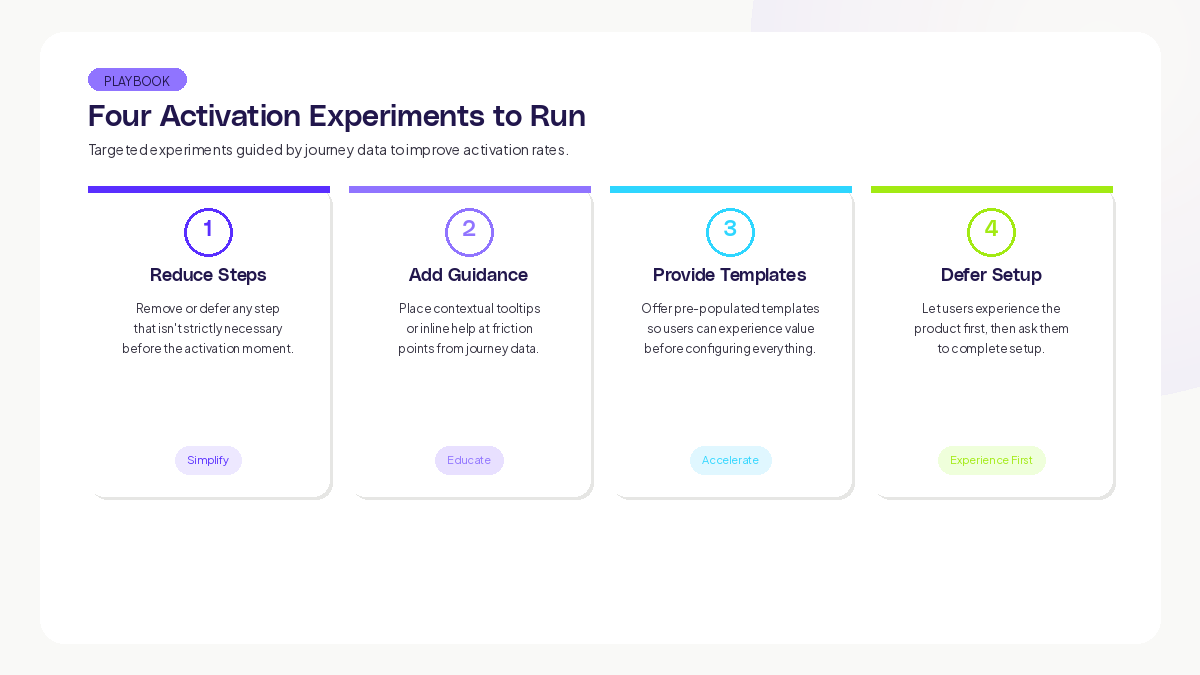
- Reduce steps: Remove or defer any step that is not strictly necessary before the activation moment.
- Add guidance: Place contextual tooltips or inline help at friction points identified in journey data.
- Provide templates: Offer pre-populated templates or sample data so users can experience value before configuring everything.
- Defer setup: Let users experience the product first, then ask them to complete setup.
After each experiment, measure both the activation rate and the journey-level metrics (path efficiency, TTV, friction signal density). A change that improves activation rate but increases friction signals may be a short-term win with long-term costs.
The activation metrics dashboard
Build a dashboard with these components:
Header metrics (update daily):
- Overall activation rate (Day 7)
- Time to value (median and P90)
- Setup completion rate
Trend charts (7-day rolling):
- Activation rate over time
- TTV distribution over time
- Drop-off rate at each activation step
Segment breakdown (update weekly):
- Activation rate by acquisition source
- Activation rate by device
- Activation rate by user type
Journey health (update continuously):
- Friction signal density at each activation step
- Most common activation paths (top 5)
- Most common abandonment points
This dashboard gives your team a complete view of activation health. When any metric moves, the journey data tells you why.
Key takeaways
Product activation is the highest-leverage optimization most teams can make. Every percentage point improvement in activation rate compounds into higher retention, more expansion, and faster revenue growth.
The five metrics that matter: activation rate, time to value, path efficiency, setup completion rate, and friction signal density. Track all five. Optimize based on journey data that shows you the actual paths users take, not the paths you assumed.
Start by defining your activation moment precisely. Map the real paths users take to reach it. Find the drop-off cliff. Fix it. Measure the impact. Then repeat.
Teams using Adora's journey maps and session replays can see exactly where new users succeed and struggle, with AI-powered signals that flag friction automatically.
Track this metric at each step of the activation flow to identify exactly where friction concentrates.
Related posts

Why We Built AI Product Insights
The story behind Adora's AI Insights, and why I think this is the future of how product teams operate.

Data-driven off a cliff: why dashboards are dead
Dashboards are dead. Not because data doesn't matter. But because the way we've been accessing it was never actually built for the people making product decisions. Here's what went wrong, and what comes next.

SaaS Pricing Pages to Sign Up Journeys
This teardown analyzes SaaS pricing pages and their connected sign up journeys. Learn how leading SaaS companies design pricing, CTAs, and sign up flows that reduce friction and increase conversion.