User Behavior Analytics: The Complete Guide for Product Teams
User Behavior Analytics: The Complete Guide for Product Teams
User Behavior Analytics: The Complete Guide for Product Teams
Your product generates thousands of data points every day. Users click, scroll, navigate, hesitate, and sometimes leave without a trace of why. User behavior analytics turns that raw activity into something you can actually learn from.
This isn't about vanity metrics or dashboard theatre. It's about understanding what your users do, why they do it, and what you should build (or fix) next. This guide gives you the practical framework to make user behavior analytics work for your product team.
What user behavior analytics actually means for product teams
User behavior analytics is the practice of collecting, analysing, and interpreting data about how people interact with your product. That includes everything from which features they use to how they navigate between screens, where they get stuck, and what makes them come back or leave.
The key distinction from traditional product analytics is the focus. Traditional analytics tells you what happened: page views, conversion rates, feature adoption percentages. User behavior analytics tells you how it happened: the actual paths users took, the moments they hesitated, the patterns that distinguish users who succeed from users who don't.
Gartner's research on product analytics positions behavior analytics as a shift from measuring outcomes to understanding experiences. Instead of asking "what percentage of users completed onboarding?" you ask "what did the users who dropped off actually experience during onboarding?" The first question gives you a number. The second gives you something to fix.
The four layers of user behavior data
User behavior data isn't a single thing. It comes in layers, and each layer answers different types of questions. Understanding these layers helps you decide what to collect and how to use it.
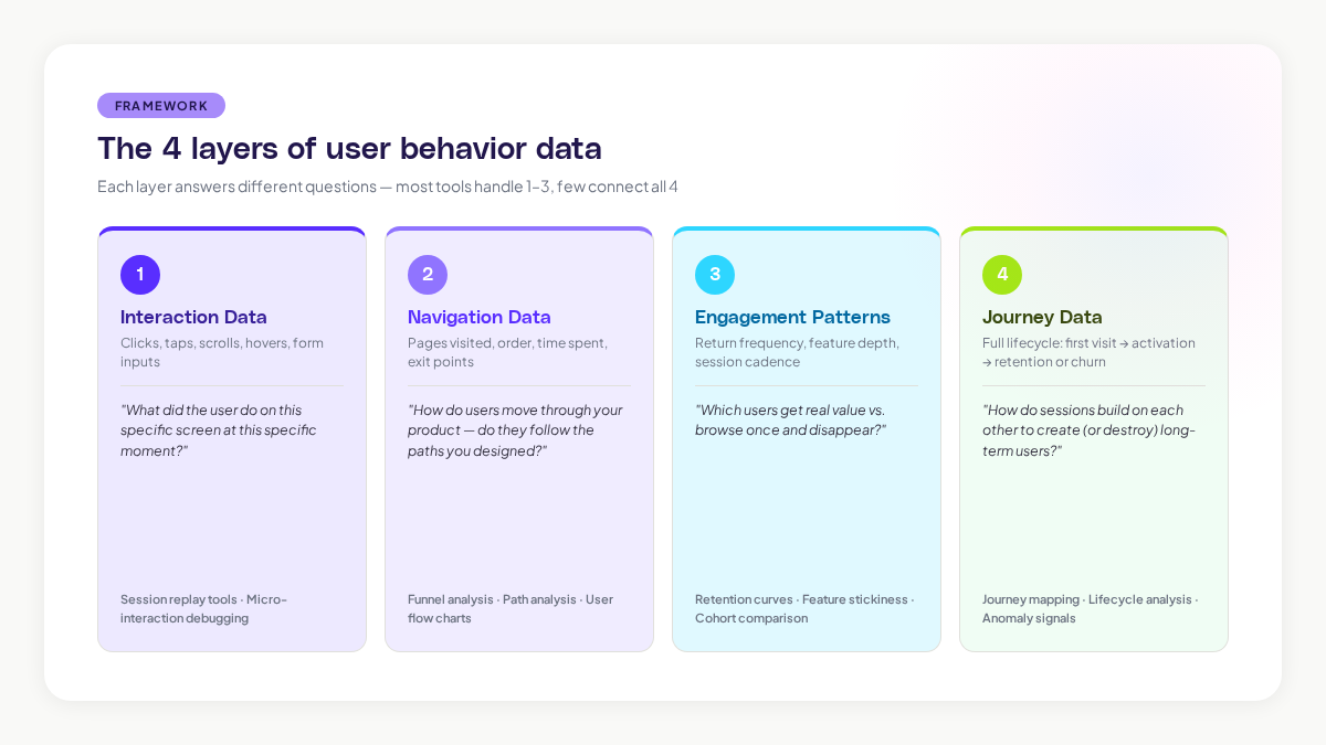
Layer 1: Interaction data
This is the most granular layer. Clicks, taps, scrolls, hovers, form inputs, and keyboard actions. Interaction data tells you exactly what a user did on a specific screen at a specific moment.
Interaction data is what session replay tools capture. It's incredibly rich for diagnosing specific problems: a confusing button placement, a form that frustrates users, or a feature that nobody can find. The limitation is that it's narrow. You see the trees, not the forest.
Layer 2: Navigation data
Navigation data tracks how users move through your product. Which pages they visit, in what order, how long they spend on each, and where they exit. This is the data behind user flow charts, funnel analysis, and path analysis.
According to research from the Nielsen Norman Group, users form expectations about where information should be within 50 milliseconds of seeing a page layout. Navigation data reveals whether your product's structure matches those expectations or fights against them.
Layer 3: Engagement patterns
Engagement patterns look at behaviour over time. How often does a user return? Which features do they use repeatedly? What's their session frequency and depth? Engagement data powers retention analysis, feature stickiness metrics, and cohort comparisons.
This layer is where you start to see the difference between users who get value from your product and users who are just browsing. A study by Mixpanel found that the median SaaS product retains only 25% of users after the first week. Engagement pattern analysis helps you understand why the other 75% leave, and what the retained users are doing differently.
Layer 4: Journey data
Journey data connects all the other layers into a complete picture of the user experience. It maps the full path from first visit through activation, engagement, and either retention or churn. Journey data shows you not just individual sessions, but how sessions build on each other over time.
This is the hardest layer to capture and the most valuable. Most tools handle layers 1-3 well. Few tools connect them into journeys automatically. When you can see the full journey, you can identify the specific moments and sequences that determine whether a user becomes a long-term customer or disappears.
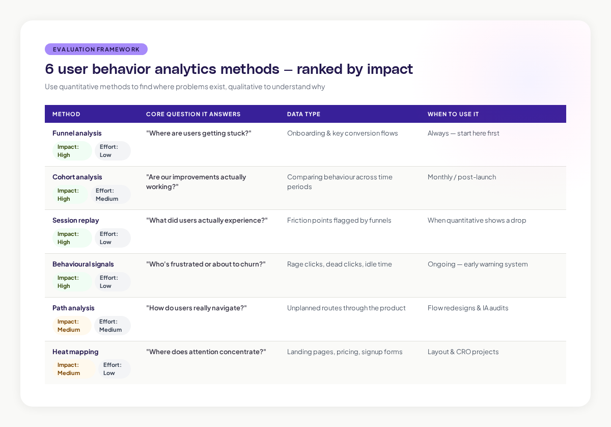
Methods that actually work for product teams
There's no shortage of analytics methods available. Here are the ones that consistently produce actionable insights for product teams, ranked by their impact-to-effort ratio.
Funnel analysis: find where users get stuck
Funnel analysis tracks users through a defined sequence of steps. Onboarding funnels, checkout funnels, feature adoption funnels. At each step, you see what percentage of users continue to the next step and what percentage drop off.
The value of funnel analysis is its clarity. It immediately shows you where the biggest drop-offs are, which tells you where to focus your improvement efforts. Research from the Baymard Institute found that the average online cart abandonment rate is 70.19%. Funnel analysis breaks that number down into specific steps, so you can target the step where you're losing the most users.
The limitation: funnels assume a linear path. Real user behavior is rarely linear. Users skip steps, go back, take detours, and arrive through unexpected routes. Funnel analysis works best as a starting point, not a complete picture.
Cohort analysis: compare groups over time
Cohort analysis groups users by a shared characteristic (usually their signup date) and tracks their behaviour over time. This lets you compare how different groups of users behave and, critically, whether your product improvements are actually working.
For example, if you redesigned your onboarding in March, you can compare the March cohort's retention against the February cohort's. If retention improved, the redesign worked. If it didn't, you have more work to do.
The power of cohort analysis is that it controls for time. Without cohorts, an increase in overall engagement could be caused by a product improvement or just seasonal traffic changes. Cohorts separate the signal from the noise.
Session replay: watch the actual experience
Session replay records user interactions and lets you play them back as video-like reconstructions. You see exactly what the user saw, where they clicked, where they hesitated, and where they gave up.
This is the most qualitative method on the list, and that's its strength. Numbers tell you there's a problem at step 3 of your onboarding funnel. Session replay shows you a user spending 45 seconds staring at a confusing modal before closing it and navigating away. That level of detail turns "there's a drop-off here" into "the tooltip text is misleading and users don't know what to do next."
The challenge is scale. You can't watch every session. The most effective teams use quantitative methods (funnels, cohorts) to identify where problems exist, then use session replay to understand the specific experience at those friction points.
Behavioural signals: detect intent and frustration
Behavioural signals are specific user actions that indicate something meaningful. Rage clicks (rapid repeated clicks on the same element) suggest frustration. Rapid page switching might indicate someone is lost. Extended idle time on a form could mean confusion.
Research from FullStory's analysis of user frustration signals found that rage clicks correlate strongly with user churn. Users who experience rage clicks are 5.6 times more likely to leave a negative review.
Adora's Signals feature automatically detects these behavioural patterns across your user base. Instead of manually watching recordings to spot frustration, you get flagged when a meaningful signal appears, so you can investigate the context and fix the underlying issue.
Path analysis: understand real navigation patterns
Path analysis maps the actual routes users take through your product, as opposed to the routes you designed for them. It shows you the most common paths, the unusual paths, and the paths that lead to specific outcomes.
This method is especially powerful for uncovering unexpected user behaviour. You might design a feature to be accessed through the main navigation, only to discover that most users reach it through a search bar or a link on a completely different page. Path analysis reveals these real-world patterns.
Heat mapping: visualise engagement density
Heat maps aggregate interaction data across many users into a visual overlay. They show where attention concentrates, how far users scroll, and which elements attract clicks.
Heat maps are quick to generate and easy for non-analysts to interpret. They're particularly useful for evaluating landing pages, signup forms, and pricing pages, essentially any page where the layout directly influences a specific outcome.
The caveat: heat maps show you where users interact but not why. A high-click area might be getting clicks because users find it valuable, or because the interface is confusing and they're hunting for the right thing. You need other methods to interpret the "why."
Building your analytics stack: what to prioritise
You don't need to implement everything at once. Here's a practical sequence for building your user behavior analytics capability.
Start here: event tracking and basic funnels
Before you do anything fancy, make sure you're tracking the core events in your product. User signup, feature activation, key actions, and conversion events. Build funnels for your most important flows. This gives you a quantitative foundation to build on.
The Product-Led Growth Collective recommends starting with what they call "breadcrumb events," the minimum set of events that trace a user's path from signup to value realisation.
Add session replay for qualitative depth
Once you know where problems exist (from your funnels), add session replay to understand why they exist. Focus your viewing time on the specific flows and moments where quantitative data shows friction. Don't try to watch everything.
Layer in behavioural signals
As your analytics practice matures, start identifying and tracking behavioural signals that predict important outcomes. Which actions predict long-term retention? Which frustration signals precede churn? These signals become early warning systems.
Graduate to journey mapping
The final layer is connecting individual sessions and events into complete user journeys. This is where you move from understanding moments to understanding experiences. Journey mapping requires more sophisticated tooling, but it produces the deepest insights.
Common mistakes product teams make with behavior analytics
After working with hundreds of product teams, certain patterns of misuse come up repeatedly. Here's what to avoid.
Drowning in data without asking questions first
The most common mistake is collecting mountains of data without a clear question in mind. Analytics is only useful when it answers a specific question. "How do users experience our onboarding?" is a question. "Let's track everything and see what's interesting" is a recipe for confusion.
Start every analytics effort with a hypothesis. "We believe users are dropping off at the plan selection step because they don't understand the difference between plans." Then collect the data you need to test that hypothesis.
Optimising for the wrong metric
Goodhart's Law states: "When a measure becomes a target, it ceases to be a good measure." Product teams fall into this trap constantly. They optimise for time-on-page, not realising that more time might mean confusion rather than engagement. They maximise clicks, not realising that fewer clicks to a goal is actually better.
Choose metrics that genuinely align with user value. Time to complete a task is usually better than time on page. Task success rate is usually better than page views. Retention rate is almost always better than signup rate.
Ignoring qualitative context
Numbers without stories are dangerous. A 5% decrease in a conversion rate is just a number until you watch five session recordings and see users struggling with a new design change. Always pair quantitative data with qualitative observation.
Treating analytics as a one-time project
User behaviour isn't static. It changes as your product evolves, as your user base grows, and as market conditions shift. The teams that get the most value from behavior analytics treat it as an ongoing practice, not a one-time audit.
Privacy considerations you can't ignore
User behavior analytics involves collecting data about real people, and that comes with real responsibilities. GDPR, CCPA, and other privacy regulations set clear rules about what you can collect, how you store it, and how you get consent.
The basics: always get informed consent before tracking user behaviour. Mask personal data in session recordings. Set clear data retention policies. Limit access to behavioral data to the team members who need it. For a detailed walkthrough, see our session replay GDPR compliance guide.
Privacy isn't just a legal requirement, it's a trust issue. A survey by Cisco found that 86% of consumers care about data privacy and want more control over how their data is used. Getting privacy right isn't just about avoiding fines. It's about maintaining the trust that makes your product relationship possible.
Turning behaviour data into product decisions
The point of all this analysis isn't to create beautiful dashboards. It's to make better product decisions. Here's how to close the loop from insight to action.
Connect behaviour to outcomes. For every behaviour pattern you identify, ask: what outcome does this lead to? Users who complete the interactive tutorial are 3x more likely to convert to paid. Users who experience a loading error in the first session are 40% more likely to churn. These connections turn observations into priorities.
Share insights in context. Don't dump a 20-page analytics report on your team. Share specific, contextual insights where they'll be most useful. Show the designer a session recording of a user struggling with their latest design. Show the engineer the error that precedes 60% of support tickets. Show leadership the behaviour pattern that predicts churn.
Measure the impact of changes. After you make a product change based on behavioral insights, go back and measure whether it worked. Did the friction point you identified actually improve? Did the behaviour pattern change? This closes the feedback loop and builds your team's confidence in data-driven decisions.
Build a habit, not a project. The most successful teams review behavioral data weekly. They have a regular cadence for watching session recordings, reviewing funnel performance, and checking engagement trends. When behaviour analytics becomes a habit, it stops being a special project and becomes how your team thinks about the product.
What the future of user behavior analytics looks like
The tools and methods are evolving quickly. Two trends will shape the next few years.
First, AI is making pattern discovery automatic. Instead of analysts hunting through data for insights, AI will surface behavioural patterns, anomalies, and opportunities proactively. The shift from "pull" analytics (you ask a question and get data) to "push" analytics (the tool tells you what you should look at) is already happening.
Second, behavioural data is becoming more connected. Instead of siloed tools for different types of analysis, the market is moving toward unified platforms that combine session replay, journey mapping, engagement analytics, and behavioral signals in a single view. This integration means faster insights and less time spent stitching together data from different sources.
For product teams, the practical implication is clear: start building your analytics practice now. The teams that understand their users' behaviour today will have a significant advantage as these tools become more powerful. And the foundation, asking good questions, collecting the right data, and turning insights into decisions, stays the same regardless of which tools you use.
Related posts

Why We Built AI Product Insights
The story behind Adora's AI Insights, and why I think this is the future of how product teams operate.

Data-driven off a cliff: why dashboards are dead
Dashboards are dead. Not because data doesn't matter. But because the way we've been accessing it was never actually built for the people making product decisions. Here's what went wrong, and what comes next.

SaaS Pricing Pages to Sign Up Journeys
This teardown analyzes SaaS pricing pages and their connected sign up journeys. Learn how leading SaaS companies design pricing, CTAs, and sign up flows that reduce friction and increase conversion.